About Chinese Type Design - 2/3
- Category
- Article
- Year
- 2023
Introduction
This is the second part of a set of three articles. The previous one is about Chinese characters (also called Hanzi) themselves, and if you haven’t read it yet, we strongly recommend you to do that before going further.
In this part, there will be an introduction about Hanzi in the digital world and an overview of questions like: in which context did they join the digital era and how? What are the technical particularities specific to Chinese script? How much money and how long does it take to design a Chinese typeface and why? And (as adaptive clever minds), we will also guide you through some possible alternative solutions.
These points are enough to get an idea for a generic project and are explained in broad terms. Each and every single project requires a custom-made plan*, because each plan is made for months of work with more than one designer.
*Plans considering realistic terms, respect of the team members and high-quality typefaces only.
Let’s go digital, let’s go technical
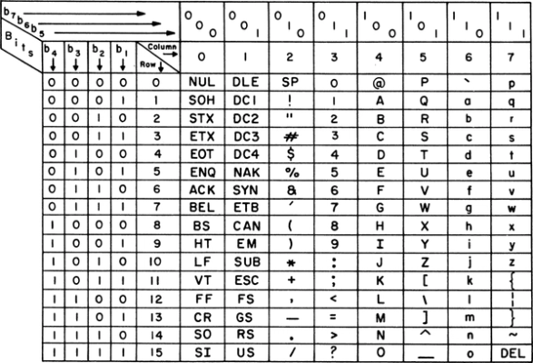
Our modern digital systems are heavily based on the Latin alphabetical system. They were created to work perfectly with English, the language spoken by the engineers from the United States who created character encoding systems to represent text in computers such as ASCII (1963), which has been replaced later by Unicode 1.
We all know that the entire world doesn’t (only) speak English. But, our modern world as it is today does largely use English as a common language. Many others using writing systems that are different from the Latin alphabets have to find their way in and try to fit into that system.
Chinese characters in different encoding systems
Since the early 1990s, a specific coding system has been developed by a collective of professionals and language experts around the globe to cover more glyphs than ASCII or any other code: Unicode.
The number of glyphs existing in Unicode has been continuously growing ever since, covering today almost every writing system for almost every language (modern and dead). There are even pictograms and emojis 🤪. Every single glyph is attributed with a unique and individual code name so that it is best managed by electronic devices 2.
The Unicode standard is now used as the most common system in every device throughout the world to ensure the integrity of the information being exchanged between multiple and/or different machines.

With Latin scripts and its alphabetical system, some hundreds of glyphs are enough to cover multiple languages, including all sorts of punctuation, ligatures, diacritics, and whatnot.
But a Chinese typeface needs a lot more if you want it to be actually useful (do you remember how it works?). It requires a character set that covers enough of the language to avoid encountering missing characters, which, whenever that happens, is often shown with a replacement character, more commonly called tofu 3.

Digital character sets
From Basic Latin, Latin Extended-B, Adobe Latin 5 (standard for Adobe’s fonts) to GF Latin Plus (standard for Google Fonts), there are multiple characters sets to choose from before starting a typeface. The choice depends on many factors such as language support or company standards.

For Chinese typefaces, there are several character sets as well, not to be chosen depending on the language support (only the Chinese language is concerned) but on contexts and territories.

As presented in our first article, there are Traditional and Simplified Chinese forms. One character can have two forms but has the same meaning and pronunciation. Traditional (one for Hong Kong, another one for Taïwan) and Simplified characters (for Mainland China) are to be found in separate character sets 4.
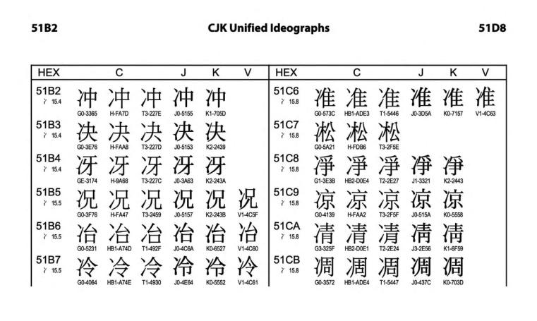
note: Hanzi are also used in the Japanese language where they are called Kanjis and are included in character sets for Japanese. In Korean, Hanzi are called Hanja and are still to be found in some situations (official documents, historical texts...), they are also included in some character sets for Korean. They are both derived from Hanzi, but have evolved and contain more or less subtle differences from their Chinese ancestors.
Design Process
Historical legacy
The earliest digital typefaces with Chinese characters were produced by Japanese firms in the middle of the 19th century. But even if Chinese characters are an integrated part of Japanese scripts and Japanese designers are more than familiar with them, their designs were different enough to the Chinese users to give them a foreign impression.
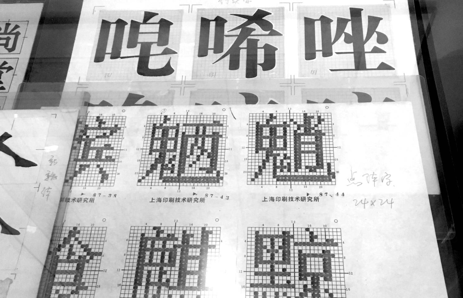
Later in the 1960s, (Mainland) Chinese government created the Shanghai Institute of Printing Technology (上海印刷技术研究所) and its team with Chinese designers to design the first Chinese digital typefaces 5.
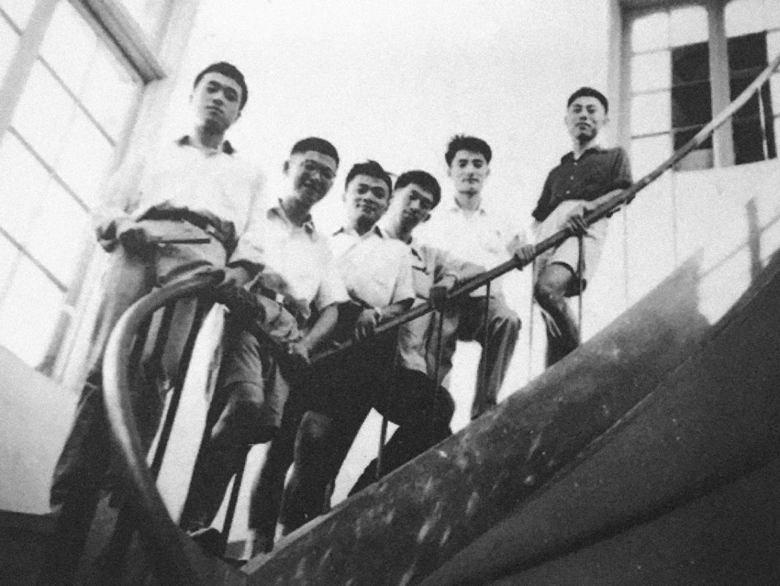
They started with two classics that were most used — in Songti and Heiti styles — using traditional tools and techniques: brush, ink, white-out and paper, then digitization of the sketches from scanned drawings. These techniques were extremely time-consuming (a few characters were designed per day and per designer) and quality requirements were very high (they were drawing the official typefaces for the country).
Great things need time
Today, things haven’t changed as much compared with Latin typeface design production due to the number of characters, their variety of shapes and technologies that are quite unfit for Hanzi’s system.
For companies and studios, big and small, corporate or independent, the design process of Chinese typefaces is very lengthy and requires either lots of time or lots of people to achieve... In most cases, it requires both.
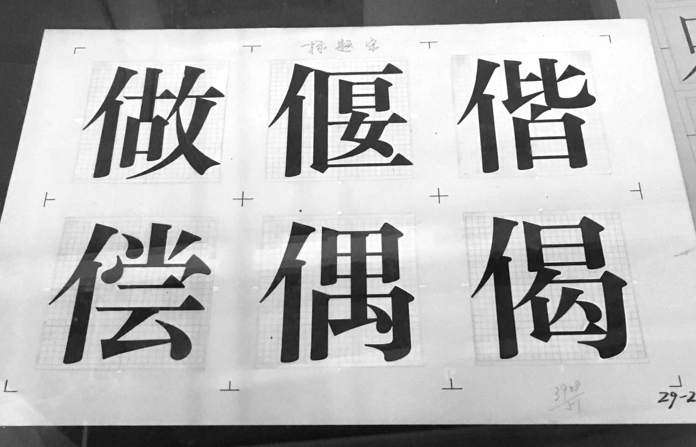
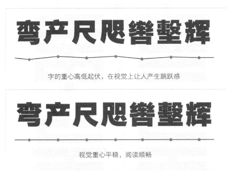
With the high number of Hanzi and the variety of shapes, there are also two major constraints that require extensive adjustments for each and every single character: they are set in a bounding box with the same dimensions for every character of the same typeface. From the most simple one (one stroke) to the most complex ones (up to 60 strokes!), they have to be squeezed into the same frame. Most of the work is about adjusting stroke positions, their thickness and the size of white spaces to get a consistent color and fluid reading experience. Like many other things in Chinese culture, it is all about harmony and balance ☯.


Machines can help, but no matter how intelligent or fancy they are, these will always be tools. Characters are made by humans, for humans, and can only be accomplished by humans to look great.
The largest type companies in China have their own tools that help with their production speed, but these are kept eagerly secret, as massive investments have been placed in those mysterious tools. Some type design applications — accessible to and used by independent designers today — have extensions that help with speeding up at some level, using parts of characters as components to be repeated in every other character that contains such parts. But, again, a designer’s expertise is always needed.

Just like any design project, time estimation is always about custom estimations given by each project’s brief, constraints, requirements and so on. The more information there is, the more precise the estimation can be.
You would think that this still doesn’t quite answer the “how much time?” question. In very broad terms though, it can take from a minimum of 6 months for the simplest character set and style, to... many years, if not a decade for a superfamily 😱!
Of course, such a timeline could always be shortened. But it would necessarily mean that less care is given to more characters... It is up to the client (and the designers) to decide between the triad of:
Quality 💎, Time ⏰ and Money 💰.
And a lot of money too
Once every week (or day), there are new typefaces being released in Latin script. Latin typefaces are manageable by a single designer, from the designing step all the way to the license sales and management. But for Chinese typefaces, that is unfortunately still technically impossible today. Unless someone has enormous personal capital to cover several years or decades of time to work on one typeface only, it is unrealistic for independent designers to consider it as a self-initiated project.
There are always multiple people involved: from the project manager (keeps things organized and ensures fluid communication between the team and the client), the design director (keeps the design consistent), designers (help with the production) to the type engineers (ensure that it works in the end!) 6.

For such team effort, each person’s fees have to be considered. Even though the average salary in Mainland China is lower than that of the United States, for example, it is changing 7.
Again, to answer this chapter’s question of “how much?” — also in very rough estimations for a custom project — it can start from 60k USD up to beyond a million dollars. But this all depends on many important details about the usage and needs of the typeface and terms to be agreed upon with the client.
note: the price of a single desktop license for a Chinese font from major type foundries (500 to 1,000 USD) is also much higher compared with a similar one for a Latin font (about 50 USD). For a large company that needs a typeface licensed for international usage, it is almost always more interesting to commission a custom typeface rather than licensing an existing one, both financially and strategically speaking. For Chinese fonts, the licensing system is closer to a rental one, as costs are so high that companies would go for paying licenses every year...
Important questions to ask
So, here are some questions that can be addressed before asking for a quote for a Chinese typeface:
1. Purpose
This will help select the character set for the Simplified Chinese forms.
2. Traditional and/or Simplified
Remember considering the political situation...
3. Deadline
Projects can be achieved faster than the “usual” speed, with more people, but it increases the budget.
4. Exclusivity
Terms of exclusivity are to be defined (duration, what happens upon expiration date, in which countries)
5. Design
More complex details may require more work than “plain sans serif”.
More questions, just as important
6. Design space
The design space of the typeface has to be specified: number of weights, of Masters, number of axes (Weight, Optical size, Contrast...)
7. Variable Font
In the case of a family, does it have to be a Variable Font?
8. Format(s)
Which font formats do we need to think of?
9. Hinting
For some situations, hinting is still strongly advised.
(Some) alternative solutions
There are alternate possibilities, easier and/or cheaper than the plans cited above, for cases where a custom font may not be very necessary or financially not accessible.
Pairing
Whenever a client is already using typefaces designed with other scripts, they would need a Chinese companion to complete the set. And if commissioning a custom Chinese typeface is an investment beyond their reach, there is the possibility of finding a visually matching typeface. This is a solution offered by many large foundries, mostly because it is the fastest solution (it’s already ready). It can also be the cheapest if an open-source typeface is chosen. But, be aware that this is a default solution taken by maaaany companies, and the same typefaces are seen veeeery often.
Starting from an existing font... or not
Even in Latin type design, many would create a new typeface out of an existing one by changing or removing some details… So why not apply that same process with Hanzi? The idea would be very tempting, especially if one thinks that it would reduce the project’s duration (and doesn’t care much for intellectual property…). But with the complexity of Hanzi, starting a project from scratch can be much more clever and keeps the designers free from any preexisting influence.
Custom character set
Chinese typeface production costs a lot of money and takes a lot of time because of the number of glyphs. That number can be reduced and be more relevant, and better adjusted to the project, especially if it is a display typeface for short titles or slogans. A smaller set of 4,000 most frequent characters (almost half of GB 2312) covers already more than 99% of daily used characters. This combines the good sides of both design (fully custom, no unnecessary compromise or influence) and financial aspects (much smaller budget and shorter timeframe), chosen by many Chinese brands.
Just enough for more fun
Even smaller and custom character sets are also used for very very display-style typefaces. They go from celebrities commissioning a typeface designed from their handwriting to typefaces to be installed on smartphone systems and used to display text messages in a “very personal and special” typeface.
Conclusion
You got it. Way before talking about budget and timeframe, a lot of important details are to be considered. With projects as extensive as these ones, the smallest decision can influence the entire thing quite dramatically. So, preparation is a MUST. And we are happy to help you out if you need 😉.
Links
- Source Han Serif, an open source pan CJK typeface, Adobe.
- Source Han Serif / Noto Serif CJK History & Development, CJK Type Blog by Adobe.
- Behind the painstaking process of creating Chinese computer fonts, by Tom Mullaney.
- Shanghai Type (上海活字) (website only in Chinese)
Books (in English)
- Bi-Scriptual, Typography and Graphic Design with Multiple Script Systems, by Eps51, Niggli.
- CJKV Information Processing: Chinese, Japanese, Korean & Vietnamese Computing, by Pr. Ken Lunde, O’Reilly.
- Research on Chinese Typography (collection of three), by TheType.
Related Articles
- About Chinese Type Design - 1/3
- About Chinese Type Design - 3/3 (coming soon)
- GIF from giphy.com